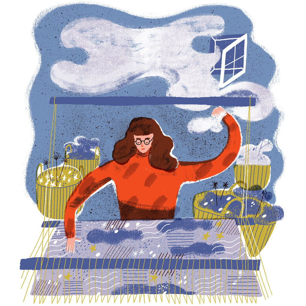
Friday 15 December 2017

Binding Design


Final Cover Design
I am pleased with the way this turned out. I felt a bit scared about finishing the binding, as I had worked for a lot longer on ideas for the inside images.


This way of working is quite different to what I usually do, although I really enjoyed the simplicity of a three colour block image. I am very pleased with my design overall and I feel that it reflects the tone of the stories well. Lighting played a big part in the way I produced the image, especially with the shadows.

Thursday 14 December 2017

Wednesday 15 November 2017

Final Illustration 2


'A dull wrack was drifting slowly across the sky, and a star or two twinkled dimly here and there through the rifts of the clouds'
(25 words)

Wednesday 8 November 2017

Final Illustration 1


'“Quite so,” he answered, lighting a cigarette, and throwing himself down into an armchair'
(15 words)

Wednesday 1 November 2017

Final Half Page Illustration


I am really pleased with my final outcome for this brief. I feel like it is a bit different to what I usually produce as I have been experimenting more with analog media, getting back in to painting. I want to keep these techniques as a part of my practice, it adds a bit more charm!

Tuesday 31 October 2017

Final Header Illustration


Thinking about the header illustration I knew I wanted it to be more clothing based - some kind of garment, because the main illustration is a scene. I chose to add a little collar and neck to make it more obvious that the type was on a shirt.

Too Flat?


I've had a bit of a problem with the development of this image. At this stage I think the image is a bit too child-like, this may be due to the flatness of the colours and shapes of the things within the frame. I spoke to Ben briefly about what I can do to change the tone of the image and he suggested adding more textures and making the image overall a bit darker.

I think my next step is to try painting some of the things within the frame, this could add more depth and help with the tone.

Sunday 29 October 2017

Ink-Tober 2017


Ink-tober helped me to think quickly and find joy in making images for no particular purpose. Although I had no set theme, most of what I drew ended up being things that I noticed from that particular day. I really enjoyed the exercise of doing a little drawing every day and then seeing them all together at the end.

Saturday 28 October 2017

Scene 1 Roughs


After playing around with photoshop brushes and my first idea of a composition for the first scene, I took some things I liked in that idea and composed a better rough of the image. I like the idea of not seeing the face of Sherlock, which is a reflection of his mysterious character. With this image, I wanted it to be almost symmetrical, whilst also including little hints of the characters.


This is my final rough for 'A Scandal in Bohemia'.

Ink-Tober 2017 Week 4


Day 22-28

Friday 27 October 2017

Photoshop Tests

I went through a few different compositions and ideas, basically at this stage I wanted to experiment more with media in order to decide on what would be the most appropriate way of demonstrating the tone and atmosphere of the stories. As I am trying to develop my digital skills I have been playing around with photoshop brushes - although I aim to introduce analog media such as painted textures too.

Wednesday 25 October 2017

Paintings


I had a lot of fun painting the different elements separately with the intention of playing around with composition on Photoshop afterwards. It's nice to be able to use analog media again, I feel much more free and able to experiment using these techniques.

Tuesday 24 October 2017

Choosing Scenes

Scene 1 - Scandal in Bohemia

  • 'His manner was not effusive. It was seldom; but he was glad, I think, to see me. With hardly a word spoken, but with a kindly eye, he waved me to an armchair, threw across his case of cigars, and indicated a spirit case and a gasogene in the corner. Then he stood before the fire and looked me over in his singular introspective fashion'
  • '...He chucked to himself and rubbed his long, nervous hands together.'
  • '...Lighting a cigarette, and throwing himself down into an armchair.'


Scene 2 - The Man with the Twisted Lip

  • 'He flicked his horse with his whip, and we dashed away through the endless succession of sombre and deserted streets, which widened gradually, until we were flying across a broad balustraded bridge, with the murky river flowing sluggishly beneath us. Beyond lay another dull wilderness of bricks and mortar, its silence broken only the heavy, regular footfall of policeman...'
  • 'A dull wrack was drifting slowly across the sky, and a star or two twinkled dimly here and there through the rift of the clouds.'
  • 'Holmes drove in silence, with his head sunk upon his breast... lost in thought.'


Scene 3 - The Musgrave Ritual

  • 'Brunton, the butler, was in the library. He was sitting, fully dressed, in an easy-chair, with a slip of paper which looked like a map upon his knee, and his forehead sunk forward upon his hand in deep thought.'... 'feeble light.'
  • 'We went down a winding stone stair, and my companion, striking a match, lit a large lantern which stood on a barrel in the corner.'
  • '...it had been used for the storage of wood, but the billets, which had evidently been littered over the floor, were now piled at the sides, so as to leave a clear space in the middle. In this space lay a large and heavy flagstone with a rusted iron ring in the centre to which a thick shepherd's check muffler was attached.'

Sunday 22 October 2017

The Book Illustration Competition 2018

The Book Illustration Competition 2018

Folio Society/House of Illustration Competition 2018
The Selected Adventures and Memoirs of Sherlock Holmes by Arthur Conan Doyle

Including -
A Scandal in Bohemia
The Man with the Twisted Lip
The Musgrave Ritual

3X Inside Illustrations
Binding Design

Friday 20 October 2017

Project Proposal

Briefs
  • Folio Society - book illustration competition.
  • Independent Leeds - fashion merry go round.
  • Publishing briefs - choose stories - books for adults - books for children - look at public domain list.
  • Illustration Friday? - Replace Ink-tober when that's over.
Rationale
  • Narrative & sequential illustration - publishing briefs - folio society.
  • Single image narrative - editorial - one word briefs (small briefs) - want to work on visual metaphors and tone - audience.
ACTION PLAN (so far)
  1. Folio Society - 3x illustrations and a binding design. Deadline 15th Jan.
  2. Ink-tober - 31 small illustrations, make a pattern, etc? Deadline 1st Nov.
  3. Independent Leeds - 1 half page illustration and 1 circle title illustration. Deadline 31st Oct.
  4. Publishing brief. Identify books/stories to illustrate.
  5. Editorial briefs. Identify articles to illustrate.

100 Word Bio

I am an illustrator from Nottingham, currently based in Leeds. My practice currently consists of shape based imagery which utilises skills in both analog and digital media, emanating detail, colour and narrative. I enjoy working with scenes and responding to literature. I acquire a lot of my inspiration from the things I like to do in my free time, such as travelling, going to the theatre, reading and drawing. I work mostly on publishing briefs for both adults and children, as well as editorial projects. 

or


Sophia Watts is an illustrator from Nottingham, currently based in Leeds/UK.

Her inspiration comes mainly from her interest in time periods and historical references, as well as fictional storytelling.

She enjoys making work that emanates detail within a scene, working mostly with publishing and editorial projects.

Thursday 19 October 2017

Independent Leeds - Brief

Image result for independent leeds

Independent Leeds
I got approached again by Independent Leeds to produce work for an editorial and title illustration. I am happy to have the experience with articles which include human interest subjects. My work is not necessarily political and wouldn't suit that world, however the more specific topics of editorials are really interesting for me to base work around. I want to do more of these kind of briefs this year.

Fashion Merry-go-round
The theme of the article I am making work for is based around the Leeds Community Clothing Exchange, themes of which are fashion and eco initiatives. I am very excited to do some work around this as it's quite different to what I am used to. 

Comfort Zones - Task

  • The development of the media I tend to go to immediately, is largely to do with my process. At the moment, I work largely with digital media and Photoshop brushes for final outcomes. Roughing is also a large part of my practice and something I really enjoy as part of refining ideas in my sketchbook. I feel that this is one of my strengths, as well as being able to produce work that is aesthetically pleasing, carrying narrative and tone. However, I feel that my practice somewhat lacks conceptually driven ideas which is something I want to think about more this year - is it enough to focus on tone/atmosphere?
  • Working with analog media is something I miss about my practice, I spent so long trying to hone in on my digital skills that it has been a while since I painted. I still draw a lot in my sketchbooks but I feel that maybe I loose a bit of charm in my work when using completely digital techniques. Hopefully I rough out my ideas enough that I keep my own 'visual signature' of portraying a feeling/setting even when working in Photoshop.
  • Looking over my more recent work, the subject matter is mostly to do with time periods. I enjoy the detail and research required when working with a specific era, usually the Victorian era. I think it could be interesting for me to start looking into other time periods, e.g. futuristic. I don't want to become a one trick pony!

Thursday 12 October 2017

Who Am I?


Who am I? - Presentation Notes
  1. Hello!
  2. Some examples from last year - narrative & scenes are what my work consists of. Shape, colour & detail is important! I would like the main part of my practice to be concerned with publishing briefs and am interested in work that is appropriate for both adults and children - Aesthetics & Tone.
  3. I would also love to continue working on editorial briefs, however I want to start being more conceptual with this side of my practice - at the moment I feel my outcomes are a bit obvious. My work fits better with human stories rather than political issues. Topics - smaller briefs.
  4. Composition rules - cop.
  5. Process - Roughing from text - Colour schemes & experimentation - Working digitally/Final imagery.
  6. Anna Bond - Aesthetic, Shaun Tan - Tone & Story telling.
  7. Jon Klassen - Subject matter & Tone of voice, Paul Blow - Editorial & Visual metaphors.
  8. Subject matter - Time periods, research, detail, costume, narrative, decor.
  9. Interests - links to subject matter.
  10. Self Portrait - following the above.

Wednesday 11 October 2017

Self Portrait


Ideas behind the final design
Following the theme of the time periods I enjoy working with, I decided to incorporate this into my self portrait. I knew I didn't want the character to be too representational, and that was the challenge for me. Eventually, the decision to put some of the motifs I tend to work with into the image helped me to focus on a concept. Overall I am happy with my outcome!

Monday 9 October 2017

Self Portrait Roughs

Final Rough
This was the final composition for my self portrait.

Initial Roughs
When thinking about how to tackle this task I thought about the elements of my practice that come up repeatedly, different signs and symbols, and the things I enjoy doing. I knew I wanted it to have a 'Victorian' feel, with a contemporary edge.

Saturday 7 October 2017

Ink-Tober 2017 Week 1


Day 1-7

I decided to try and tackle ink-tober this year! I am going to try and do a simple drawing every day for the whole month but we will see how long it lasts. So far, I am enjoying the process of just jotting down a quick image without the pressure of completing a final outcome - although I might make a more finished thing at the end.

Monday 8 May 2017

Sunday 7 May 2017

Final Printed Book


End Pages
If I had more time to finish things off I would have like to have designed a pattern for the end pages, however because I want to make a dust cover with my binding design I had to use the Italian paper we used in our book binding workshop. I went down to the print room and asked for the same paper, I really like the slight texture of it. I also managed to find a colour that both corresponded with the buckram of the cover and the inside imagery. 

Prints in the Home


Another application I wanted to explore was to produce limited edition prints. These would be distributed and sold in book shops, art shops and maybe spaces like colours may vary, alongside the publication. When I went to Waterstones I noticed some posters and prints available in the gift section. I can imagine the scene illustrations framed in a child's bedroom or maybe in a conservatory surrounded by house plants.

Saturday 6 May 2017

Kindles & I-pads


After thinking about publishing, the next step was to consider e-books and interactive options that are now available everywhere, especially is distributed as a novel rather than a picture book. To see what this would look like I mocked up a page from The Secret Garden with my spot illustration as a chapter header, as well as the cover design. The image below is what my book would look like when someone opened it on a kindle/i-pad/etc. The idea of interactive technology really interests me and is something I would like to think about more in future projects, especially in relation to promotion and social media.

Friday 5 May 2017

Inside Novel


Something I stated in my proposal was to design illustrations that would be appropriate for an adult audience. Because of this I did a mock up of how the inside of the novel could look. This would ultimately be the main purpose of the work, to sit alongside text in this kind of format. The motifs I made work well for the chapter spot illustrations, and the quotes could be a part of the layout underneath the full bleed images.

Binding Design


Today I made the final design for my dust jacket. I created the wrap around as one long image. This is partly because this means I can shape it around the books I have already made and fit it to the right size. Because of the pattern and background being white it doesn't matter too much if the sizing is slightly out. I worked generally from my roughs at the start of the project but a lot of the pattern I drew straight on to the screen, adding things as I went along. This method worked well for the natural chaotic pattern of wildflowers and I enjoyed overlaying the different shapes.

Mega Crit


I couldn't make it to the crit today as I wasn't feeling very well. However, my buddy Shelly very kindly put my work (book) out with a feedback sheet for people to leave comments on. I feel very encouraged by what people wrote, and I got some really good suggestions of what I could do next. Unfortunately, I didn't think about embossing the cover of my book and was thinking about a dust cover, I think if I considered this earlier I would have tried it out but there's not enough time now!

Thursday 4 May 2017

Book Binding


It was a challenge for me to remember how to bind the actual book. I remembered really enjoying the process of doing it during the workshop. To try and do it by myself for the first time I printed the hand out from e-studio. It went fairly smoothly and I ended up with two hardback books with my illustrations inside, something I am very happy about! It's nice to know I have this option when making a book, it just feels more professional and doesn't take that long to do. 


I chose a greeny coloured buckram for the cover to compliment my illustrations. Although in this picture it looked more brown! I want to make a cover to go around the book, hopefully I will be able to do this in time for the deadline on Tuesday!

Tuesday 2 May 2017

Title Page - Inside


I had to create a title page to include on the first page when you open the book, technically the third page, as I wanted to include two blank ones in order to bind it properly at the beginning. I remembered from speaking to James in the print dungeon that to print a booklet from InDesign the document must contains pages that are a multiple of 4. Including spare pages and a title page helps me to get this up to 16 in total, which will work for print, hopefully!

Book Page Layout - Mock


Page Layout Mock-up
My idea from the beginning of my roughing stages was to include the quote I have illustrated from on the opposing side of the image. This way I can print a whole book and it wont feel too empty. I don't think the work load will be too much as I still have some time to finalise motifs and add in the writing as I go along. I also want to create a different border for each page, one motif duplicated in each corner.

Monday 1 May 2017

Developing Motifs


I am at the stage now where I am thinking more about the opposing pages to the full bleed imagery. I have sketched out a few corner design patterns and floral motifs that I may use. I just need to work out which ideas with go best with each illustration. So far, I think I want to pair:

Illustration 1
Motif - Snake & Leaves
Corner design - Floral

Illustration 2
Motif - Dressing Table
Corner design - Leafy

Illustration 3
Motif - Globe & Leaves
Corner design - Loopy Vines

Illustration 4
Motif - Watering Can & Squirrel
 Corner design - Weaving vines

Illustration 5
Motif - Bouquet
Corner design - Vines & Leaves

Illustration 6
Motif - Key & Leaves
Corner design - Smaller floral

Sunday 30 April 2017

Finished Illustration 6


I wanted the last illustration to represent the life in the garden at the end of the book, a scenic image. The only reason really for me putting a swan in there was because I like the form of them and I wanted an excuse to draw one at some point in this project. The pureness of the swan and use of white also changes the tone of the image slightly, this one is much brighter than the others.

Writing


I drew over the quotes I wrote down in my sketchbook with the Photoshop brushes, this was so the aesthetic would match the rest of the book. Keeping the writing the same size was a bit tricky, for some reason the further I went along the bigger my hand writing got. I re-sized and changed some of the words to keep them consistent.

Saturday 29 April 2017

Finished Illustration 2 - 'And the secret garden bloomed and bloomed and every morning revealed new miracles'


I think basing this image on the interior described throughout the book helped to set the tone of the book. Also, I like the simplicity of the composition and different details of the objects in the frame. Describing character through the portraits was also something I enjoyed. This added a more interesting aspect to the illustration, inviting a viewer to think about who these people could be.

Starting Illustration 6


I wanted to produce something that reflects the growth of nature as this is talked about a lot towards the end of the book. Because of this I started to think about exterior scenes I could create, I wanted to include a pond with foliage all around.


Going over the roughs from my sketchbook is something I am learning to work from whilst changing elements as I go along. For example, I improved the shape of the swan and at first I drew it kind of like a duck.

Friday 28 April 2017

Illustration 2 - Wallpaper Pattern


This is the pattern I made to put in the background of the second illustration. Obviously, I will make it more subtle when I place it in the actual image, but doing it in these colours to start off with meant I could see what I was doing more clearly. I actually really enjoy making simple patterns, there is something very satisfying when something looks so symmetrical! Although I did miss out a couple of the motifs, which I will have to add in on the image.

Illustration 2 Development


I have most of the imagery down, but I think the background looks a bit plain. I might add in a subtle pattern to create more depth against the frames. I am happy with the overall composition, this one is much simpler than some of the others but I think it will be more interesting to look at on the whole if the pages vary slightly.

Thursday 27 April 2017

The Point of Creativity


http://illustratedladies.tumblr.com/search/thinking

Recently I have been thinking about the how I never feel completely satisfied with my work, there are always things I want to go back and change which means I never feel finished. Usually I quite like the excitement of playing around with different ideas, experimenting and arriving at something I want to develop more. But past that point I can get a bit frustrated, especially when I am running out of time (like now), because all the deadlines are so close together. I am enjoying this project a lot, I just wish I could feel more relaxed about finishing it!

Wednesday 26 April 2017

End of Module Evaluation

Project Report

Collaborative Brief Design Boards

Substantial Brief Design Boards

Small Briefs Design Boards

Starting Illustration 2


To start with I just sketched the general shapes of where I could place the frames. Later on, I decided to add in shelves with other elements on them. Also, in my test image for illustration 2 I added in cobwebs which I liked a lot, it added a bit more detail.


Going back to the second illustration I felt that the composition I used in my initial digital test was far too complicated, particularly amongst other images that embody a certain amount of detail. Therefore, I stripped down the quote I used, basing my work upon 'the faces that stared at her', in relation to portraits hanging on the wall. I wanted to focus more on the actual portraits than anything else, I really enjoy working with decor and time period themes so this seemed to be the best way to move my project forward.